STUDIO HAKOLA
The work speaks louder than the pitch
A brand that works is one that's been built right.
We start with what's true about you, then make sure the world sees it.




Clients who've found their Hygge










The Hygge Framework
Every engagement runs through the same five stages. In the same order. Because sequence is the whole point.
How's your brand.
Before anything is built, we need to know what we're actually working with. An honest assessment of where the brand stands, what's holding it back, and where the real work needs to happen.
Your brand foundations.
This is where we get clear on who you are, who you're for, and what makes you the obvious choice. The foundation everything else is built on.
Give it a voice.
The right words change everything. This is where your brand finds its message — specific enough to stop the right people, considered enough to hold up in every context.
Give it a face.
With the foundations in place, your visual identity has something real to reflect. This is where your brand becomes impossible to confuse with anyone else's.
Express it.
A brand only works when it shows up in the world. This is where it goes to work across every touchpoint that matters.
"It felt like giving birth to new thoughts and ideas. The process made us think about things differently, and helped us dig deeper to find words we didn't even know described who we are. Now all our staff across four locations can articulate our culture and values. That's the result we didn't even know we needed."
Three signals you already know.
A brand that doesn't fit isn't a design problem. It's a growth problem.

Signal 01
Dread
You sent someone to your site last week and felt it before they replied. That slight dread, because the site doesn't match the conversation you just had.
Signal 02
Mismatch
You've seen their site. Your work is better. It doesn't show. In this market, perception is the first thing buyers trust. Theirs does it. Yours doesn't. Yet.

Signal 03
Silence
They said they'd take a look. Then nothing. The conversation went well. The site couldn't carry it. No clear next step. No reason to return.
Built on strategy, refined through craft
Good design isn't decoration. It's the visible proof that someone understood the problem and solved it right. That's what happens here.
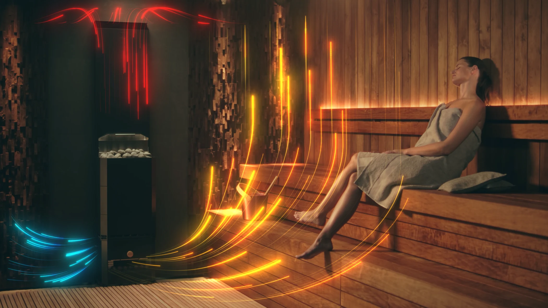
Saunum Australia
A premium wellness brand, built for a new market. Saunum is a Finnish luxury wellness technology company with a product that genuinely changes what a sauna can feel like.
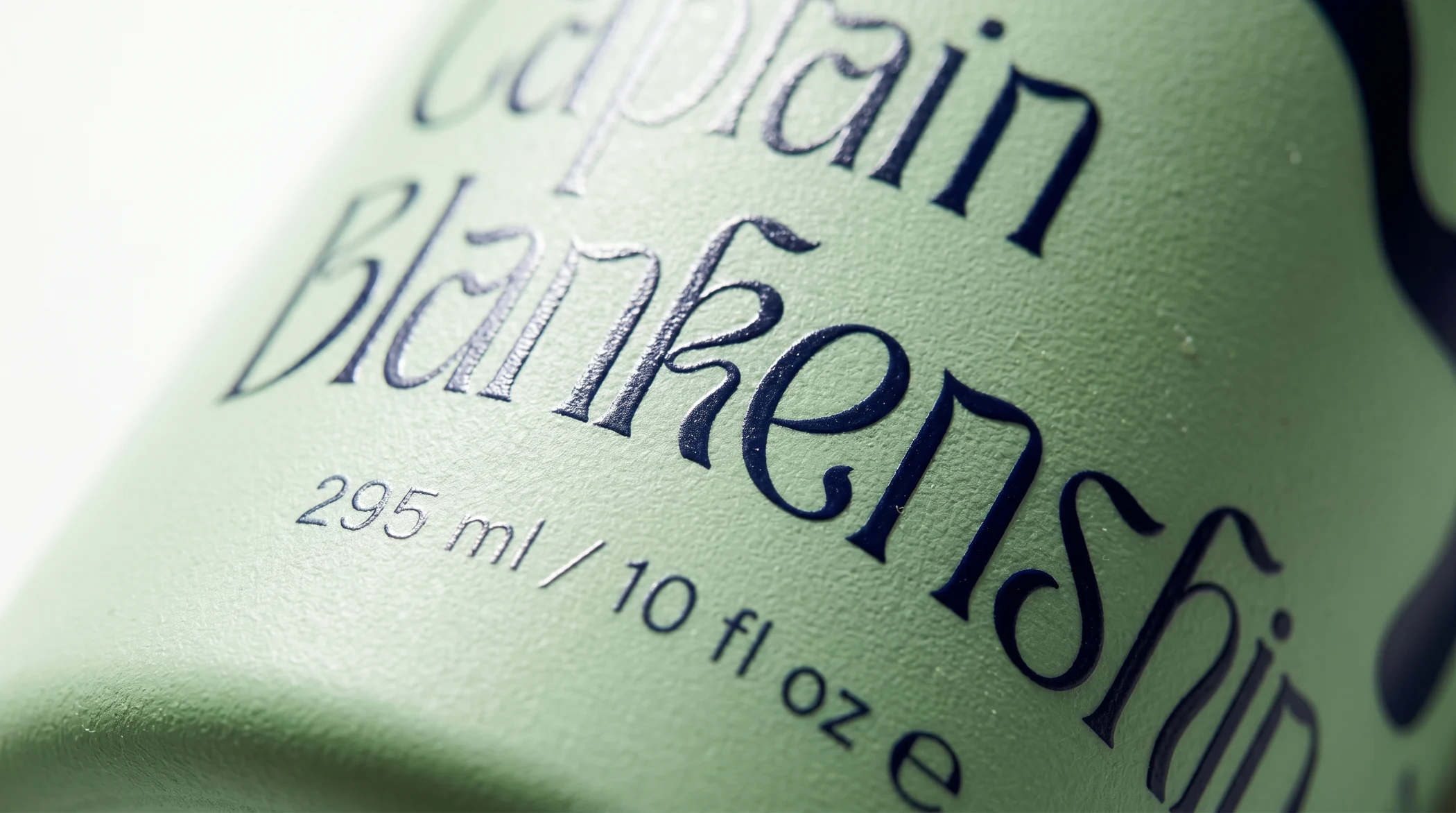
Captain Blankenship
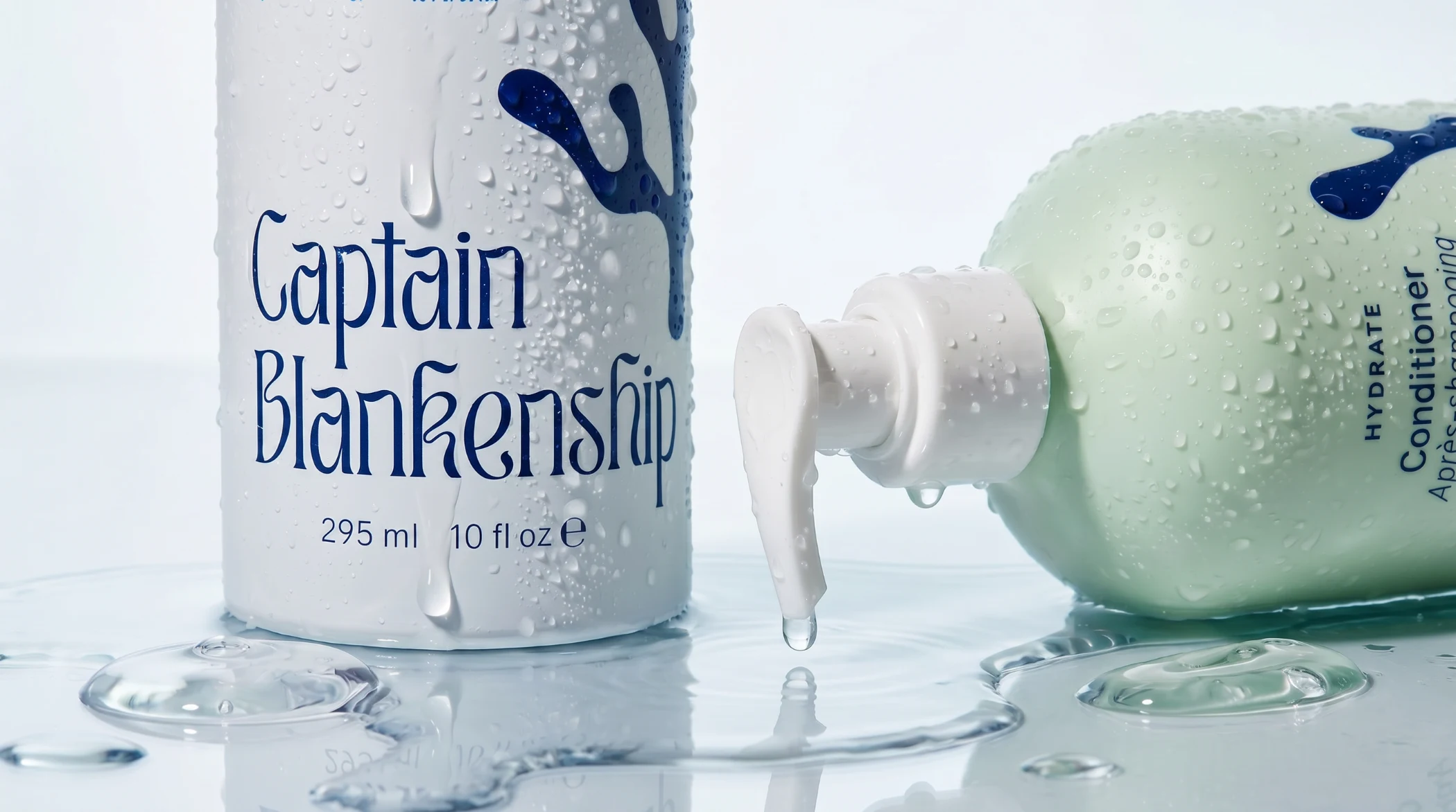
A decade of wild beauty, repositioned. Captain Blankenship is an American natural haircare brand with ten years of cult following and a story that finally needed to be told properly.
IDA+S
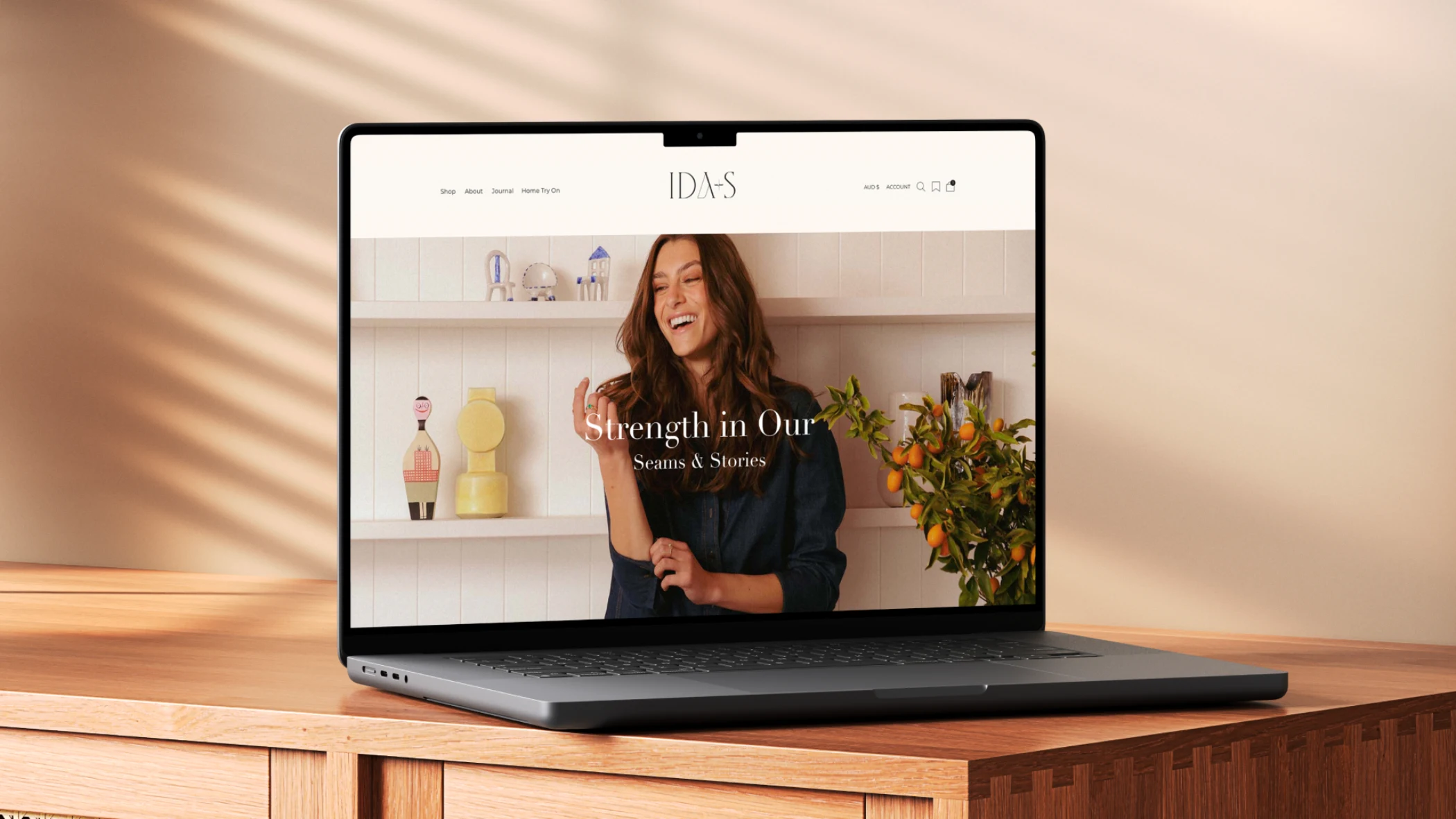
A legacy brand, built from the inside out. A sustainable luxury fashion label with a decade of history and a brand that had never fully articulated what it stood for.
Numbers that matter
A decade spent building brands that endure. Work that's been recognised, remembered, and most importantly, effective. The kind of results that speak louder than any pitch.
Brands built
Years designing
Industry awards
Start here if you're not sure.
Most people arrive thinking they need a logo, a new website, or better copy. Something visible and fixable. A logo built on unclear positioning is just a shape. A website built before the messaging is resolved is just an expensive page.
The surface stuff shows. But the surface stuff isn't the problem.